Uxxu vs IcePanel
Why Teams Get Lost in Diagram Rabbit Holes
 by Guillermo Quiros
Architecture diagrams should help teams navigate complexity. Too often, they create even more of it.
The Real Problem Is Not Drawing
Most architecture tools are good at helping teams draw diagrams.
The real challenge begins after the first diagram.
Because software systems rarely fit into a single view.
As systems grow, teams naturally create more diagrams:
- context views
- service maps
- component diagrams
- infrastructure layouts
At first, this seems normal.
But after a few weeks, a new problem appears:
Where am I inside all these diagrams?
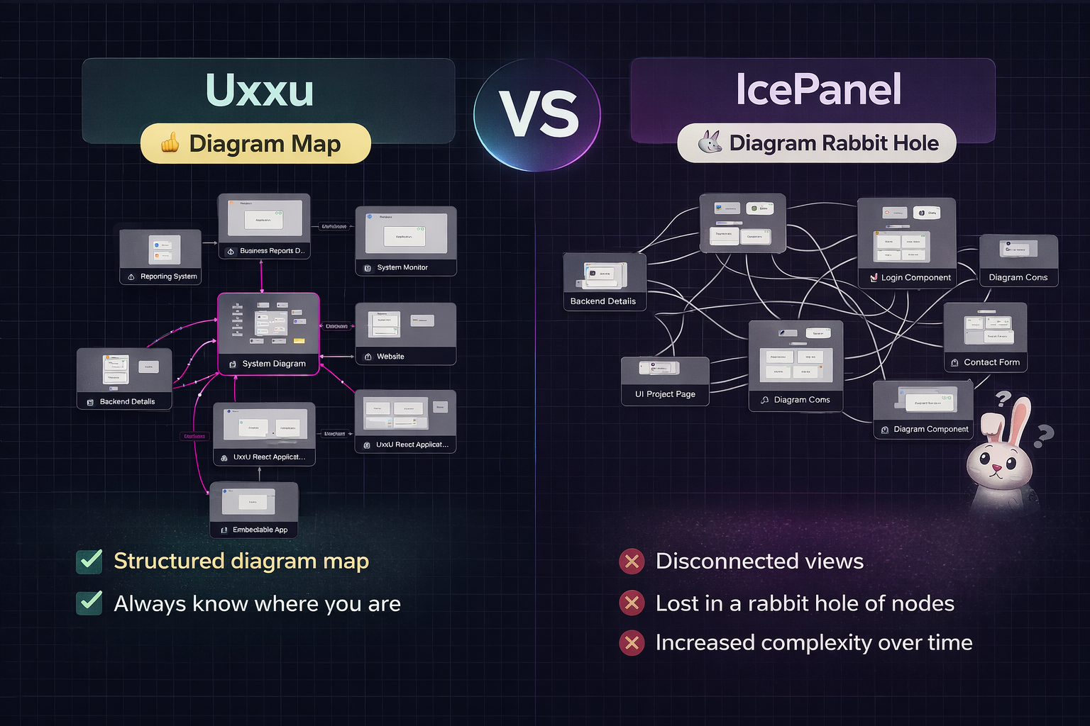
This is where many teams start falling into what I call the diagram rabbit hole.
The IcePanel Rabbit Hole Problem
One of the biggest frustrations teams experience with architecture tools like IcePanel is not the quality of the individual diagrams.
It is what happens between diagrams.
You open one system view.
Then drill into another.
Then another.
Then another.
After four or five levels, it becomes difficult to answer simple questions:
- Which diagram am I currently looking at?
- How does this relate to the system context?
- Is this a service or a subsystem?
- How did I get here?
- What connects back to the bigger architecture?
This creates a feeling of being sunk into a rabbit hole of views.
The deeper you go, the easier it is to lose orientation.
The architecture stops feeling like a connected model.
Instead, it feels like navigating isolated canvases.
Why This Matters More Than People Think
This issue is not just a UX inconvenience.
It directly impacts engineering communication.
When people lose architectural context, discussions slow down.
Developers spend time asking:
“Wait, where does this service sit in the bigger system?”
Instead of focusing on design decisions, teams waste time rebuilding mental context.
This becomes especially painful during:
- onboarding
- architecture reviews
- cross-team collaboration
- incident response
- system modernization
Where Uxxu Feels Different
This is where Uxxu introduces a major difference.
Uxxu is not just a place to create diagrams.
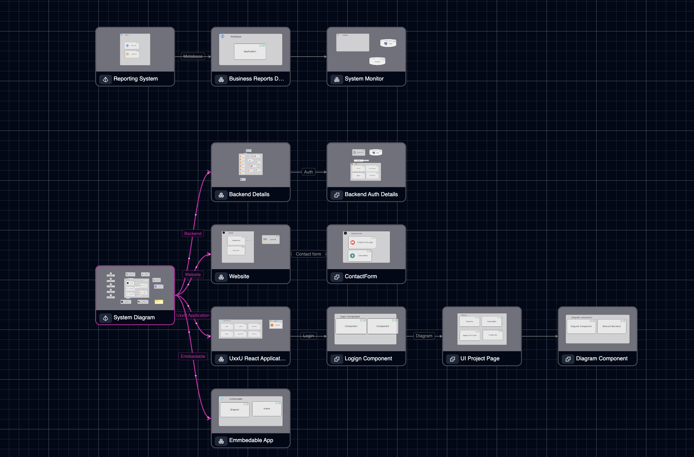
It is designed as a diagram map of diagrams.
That distinction is incredibly important.
Instead of forcing users to mentally reconstruct how diagrams relate, Uxxu makes those relationships visible.
Each diagram belongs to a larger architecture structure.
You can understand:
- where you are
- what level you are viewing
- what parent system it belongs to
- what deeper levels exist below
This dramatically reduces the “lost in diagrams” problem.
The experience feels less like jumping between files and more like navigating a living architecture system.
The Diagram Map Advantage
This is probably the biggest strategic difference between Uxxu and IcePanel.
Uxxu introduces what many teams are missing:
a map for the maps
This sounds simple, but in practice it changes everything.
Instead of disconnected diagrams, you get structured navigation across levels such as:
- System Context
- Containers
- Components
- Infrastructure
- Deployment
Each level remains connected.
The transition between views feels intentional.
You are never forced to ask:
“Which diagram did this come from?”
Because the architecture itself provides the answer.
Better for Large Systems
This becomes especially powerful in large systems.
For example:
- microservices platforms
- enterprise SaaS products
- platform engineering ecosystems
- multi-domain architectures
These environments quickly generate dozens of diagrams.
Without strong navigation, complexity multiplies.
Uxxu handles this better because the diagrams behave like a structured hierarchy, not a flat collection of boards.
Embedded Documentation: A Huge Practical Advantage
Another major difference is how easy Uxxu diagrams are to embed into existing workflows.
This is often overlooked.
Architecture documentation should not live in isolation.
Teams already work inside tools like:
- Notion
- Medium
- internal docs
- wikis
- product specs
- engineering handbooks
Uxxu’s embeddability makes it significantly easier to integrate architecture directly into the places teams already use every day.
This improves visibility and keeps architecture closer to real engineering workflows.
Instead of saying:
“Go open the architecture tool”
The diagram can live directly inside the documentation itself.
That’s a huge workflow win.
Better for Communication, Not Just Modeling
This is where Uxxu feels especially strong.
Architecture is not just about system modeling.
It is about communication.
Embedding diagrams inside Notion pages, RFCs, technical blogs, and knowledge bases makes architecture part of the conversation.
This is something many teams struggle to achieve with more isolated tooling.
The Real Difference: Navigation vs Drawing
If I had to summarize the difference in one sentence, it would be this:
IcePanel helps you draw architecture. Uxxu helps you navigate architecture.
That difference becomes more important as systems scale.
For small teams, both tools may feel similar.
For growing engineering organizations, navigation becomes critical.
Because complexity is rarely caused by one diagram.
It comes from many related diagrams over time.
Which One Is Better?
It depends on the problem you are solving.
Choose IcePanel if your primary need is:
- clean C4-style diagrams
- straightforward architecture drawing
- fast visual modeling
Choose Uxxu if your primary challenge is:
- architecture sprawl
- diagram discoverability
- onboarding complexity
- keeping context across multiple views
- embedded documentation workflows
For larger teams, this often makes Uxxu the stronger long-term choice.
Final Thoughts
The biggest failure in architecture tooling is not poor visuals.
It is loss of context.
Once teams start drowning in disconnected diagrams, architecture stops creating clarity.
That is where Uxxu’s diagram-map approach stands out.
It keeps teams oriented.
And for complex software systems, orientation is everything.